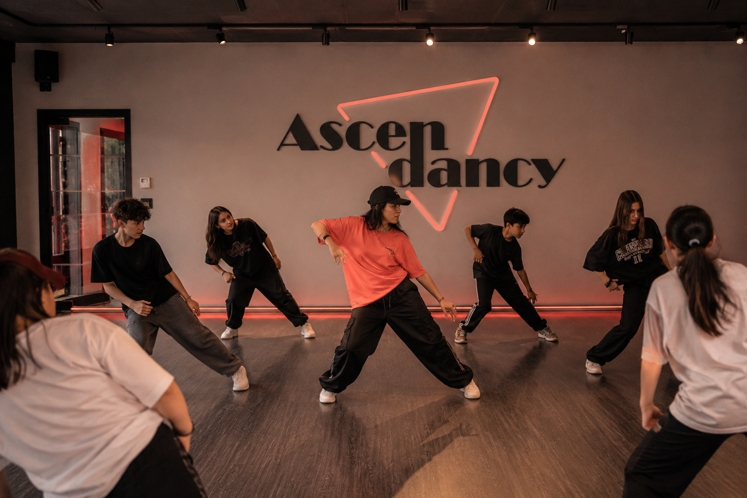
Ascendancy was born as a university project created by a group passionate about urban dance, including Hip Hop, Street Dance, and contemporary styles. Developed collaboratively, the visual identity reflects the meaning of its name, symbolizing growth, progression, energy, and movement through a geometric mark that evokes an upward arrow and the fluid dynamics of choreography. The overlapping typography, paired with a high-contrast serif typeface, reinforces a sense of rhythm and motion while creating a bold, contemporary aesthetic that balances personality with versatility.
The color palette combines a vibrant coral tone, representing energy, creativity, and youthfulness, with charcoal black, conveying strength, confidence, and sophistication. Together with the minimalist symbol, these elements form a versatile and memorable identity that captures the spirit of the group across performances, events, and promotional materials, expressing movement, artistic freedom, and continuous evolution.