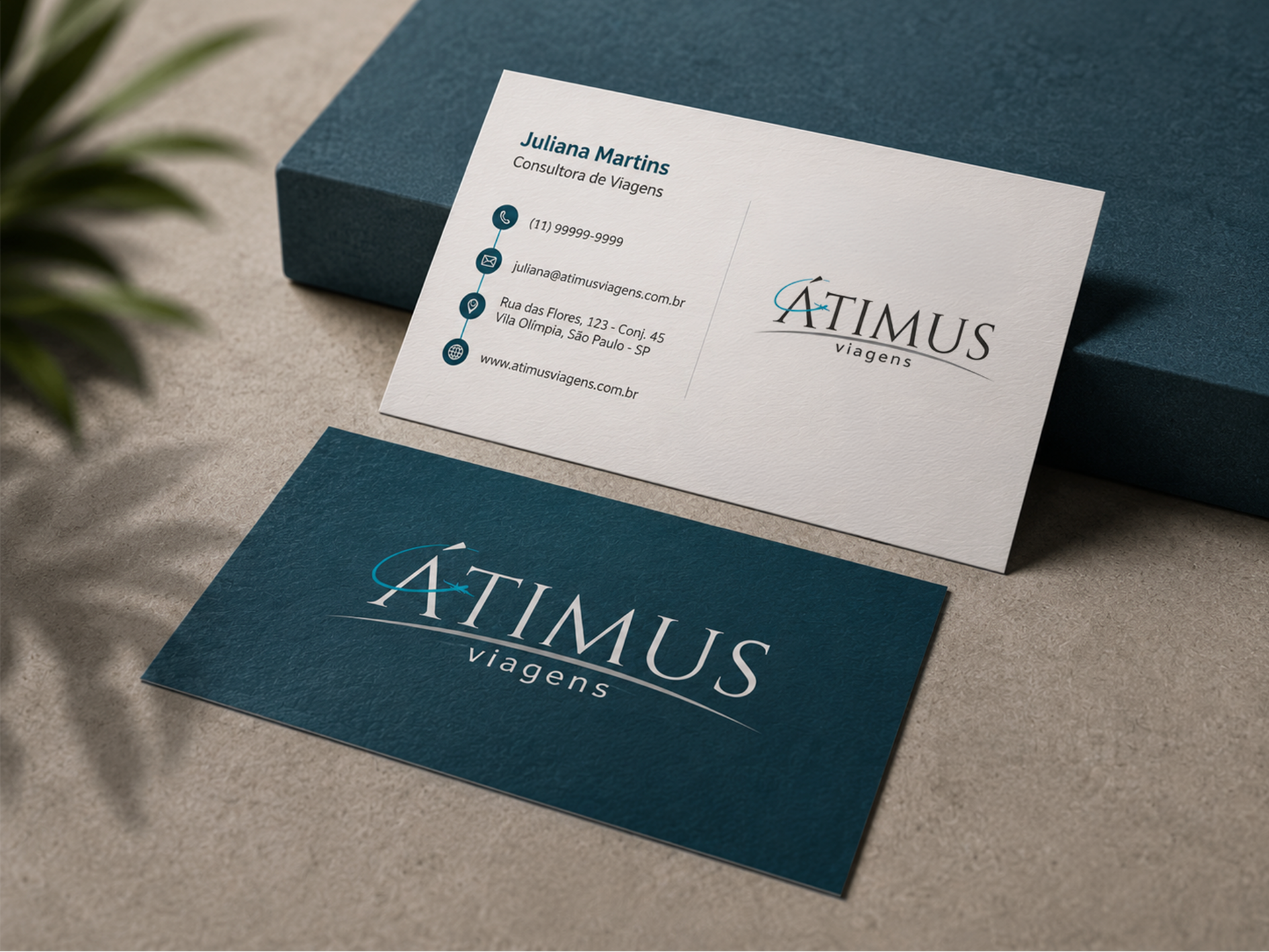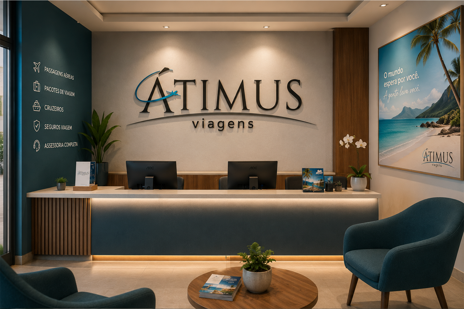
The visual identity for Átimus Viagens was created to represent a travel agency based in Belo Horizonte, Brazil, specializing in international travel and exclusive experiences in paradise destinations. The brand was designed to convey sophistication, trust, and, above all, the sense of freedom that comes with traveling. The classic serif typography communicates elegance and credibility, while its generous proportions reinforce the idea of open horizons and limitless possibilities. The graphic element surrounding the initial letter, inspired by the fluid path of a flight route, symbolizes movement, discovery, and the connection between destinations, naturally guiding the viewer’s attention to the brand name.
The visual identity combines black, gray, and turquoise tones to express sophistication, reliability, and a spirit of adventure. The turquoise evokes the sky and the sea, reflecting paradise destinations and the freedom to explore the world, while the curved line beneath the logo represents the horizon and the journey itself. Together, these elements create an elegant and memorable identity that reflects the brand’s purpose.