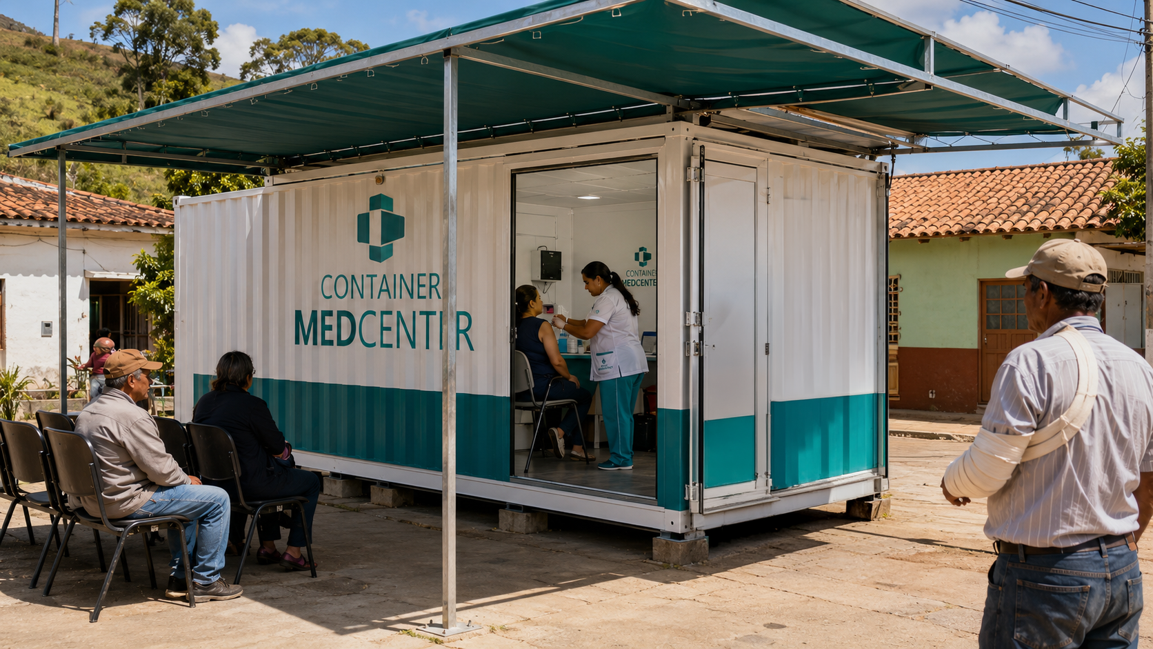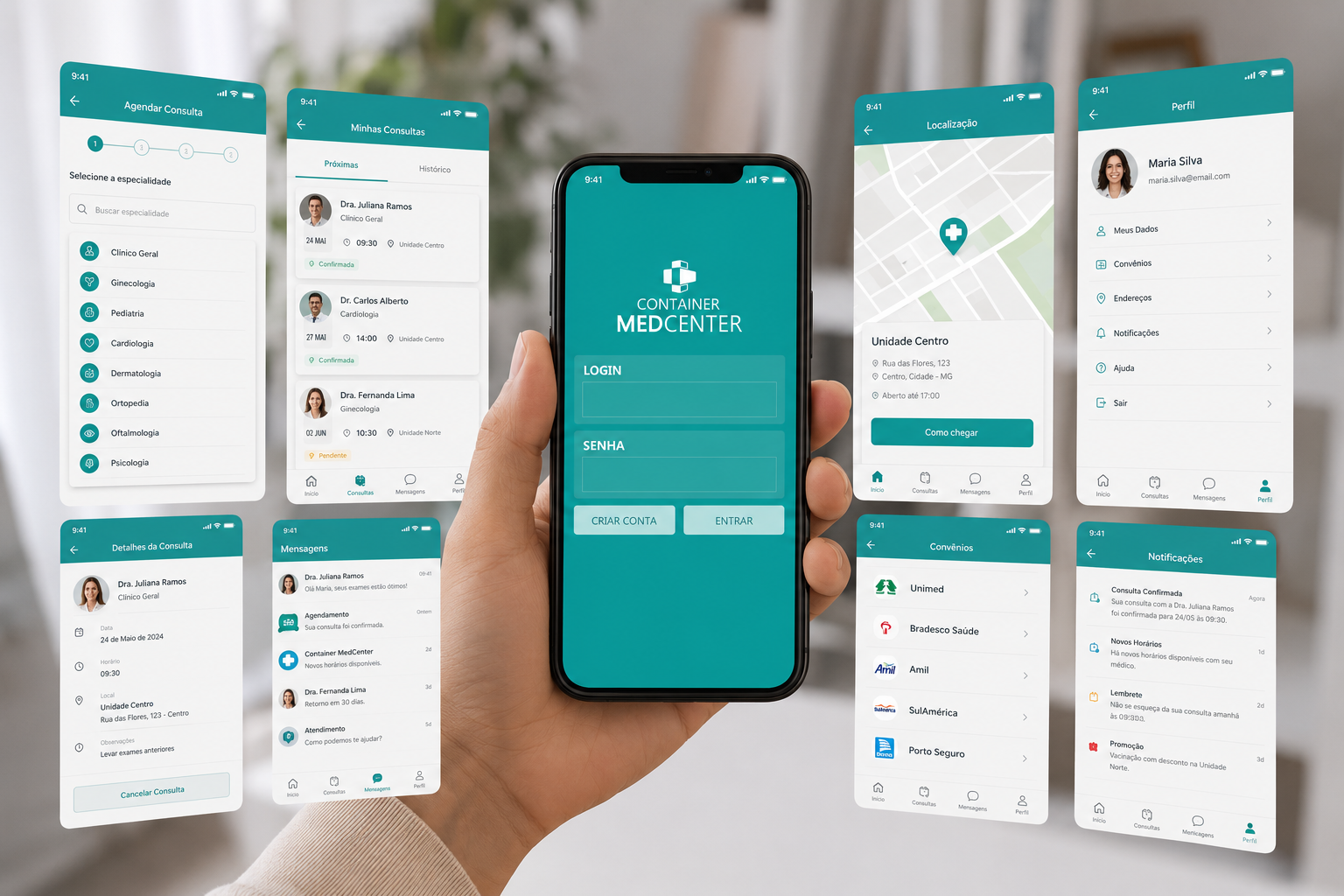
The visual identity of Container MedCenter was designed to reflect the brand's mission of bringing high-quality healthcare to remote communities where access to medical services is limited. The symbol combines two essential concepts into a single graphic element: the universally recognized medical cross, representing care, protection, and healthcare, and the silhouette of a shipping container, symbolizing mobility, structure, and the ability to transform virtually any location into a fully equipped medical facility. Together, these elements communicate the company's commitment to making healthcare more accessible, promoting dignity, prevention, and a better quality of life wherever it is needed most.
The color palette features shades of teal, a color commonly associated with healthcare, trust, balance, and well-being, reinforcing the brand's credibility and commitment to compassionate, efficient medical care. The symbol is built from clean, modular geometric forms that reference the strength and versatility of shipping containers, while the modern sans-serif typography conveys clarity, accessibility, and professionalism. The visual emphasis placed on the name MEDCENTER highlights the company's healthcare focus, resulting in a contemporary, memorable identity that perfectly aligns with its purpose of delivering medical care wherever people need it most.