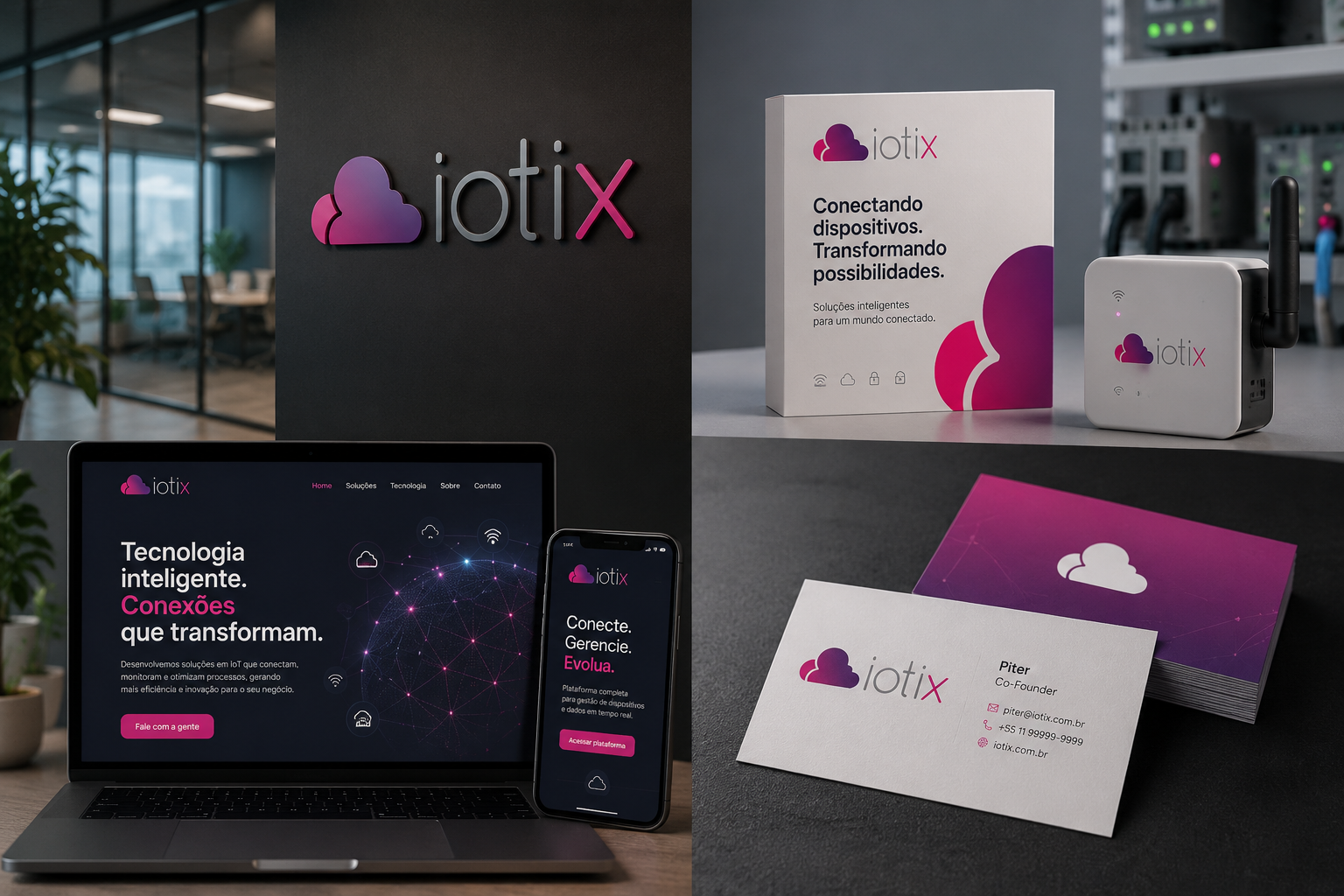
The visual identity of iotix was designed to represent the core principles of the Internet of Things (IoT), translating concepts such as connectivity, integration, and innovation into a clean and contemporary visual language. The symbol was created to convey the idea of interconnected devices and systems, where different elements work together to exchange information and make processes smarter and more efficient. This project was developed especially for two longtime friends, Piter and Thiago, reflecting the vision of a modern technology company committed to delivering intelligent, reliable, and accessible solutions.
The color palette combines a gradient of pink and purple in the symbol and the "x", representing creativity, innovation, and digital transformation, while the gray used throughout the rest of the logotype conveys balance, stability, and professionalism. This combination creates a distinctive and contemporary identity that stands out across both digital and corporate applications. The typography features clean geometric forms with soft, rounded edges, reinforcing the brand's technological character while maintaining a sense of approachability and simplicity. The result is a minimalist and versatile visual identity that aligns perfectly with the IoT industry and reflects a brand prepared to evolve alongside the ever-changing world of technology.