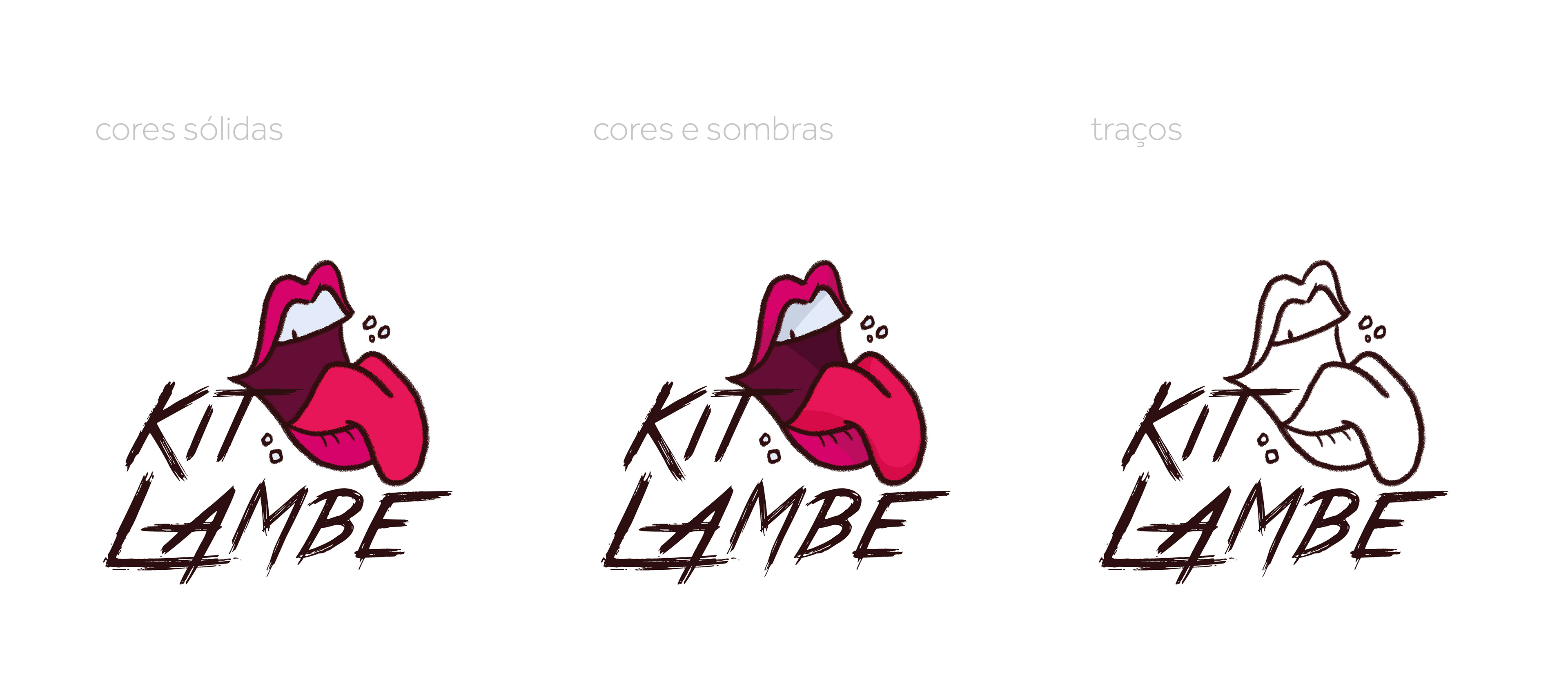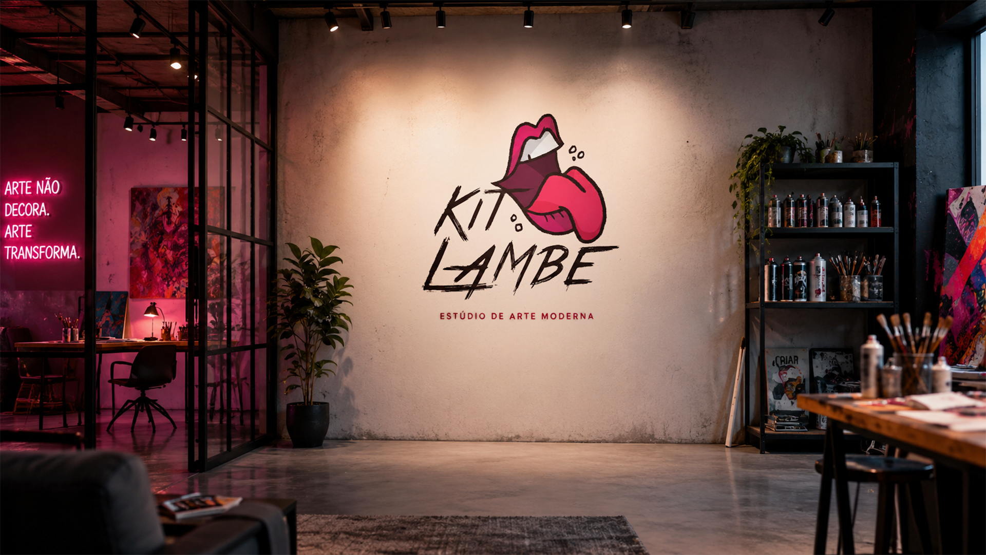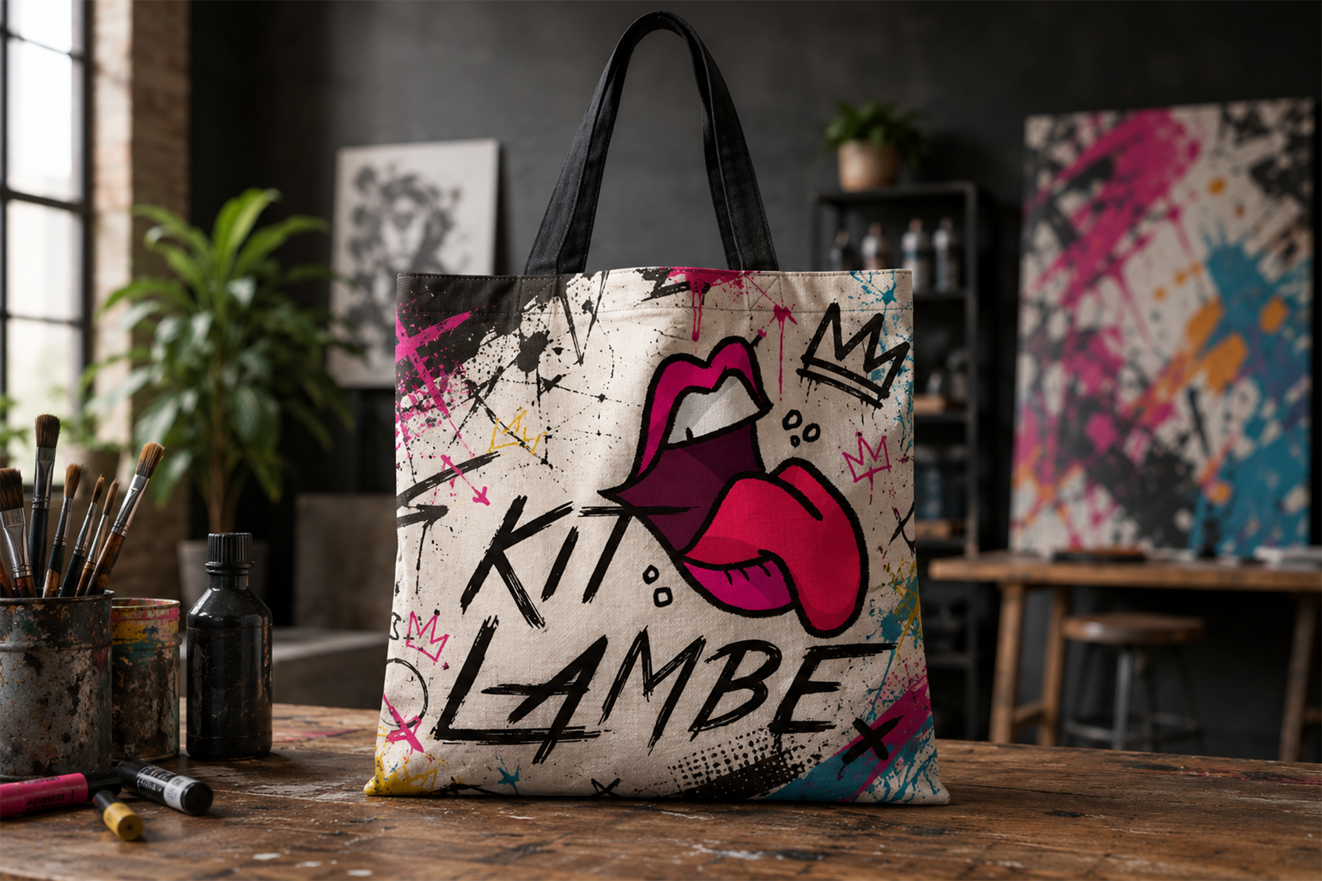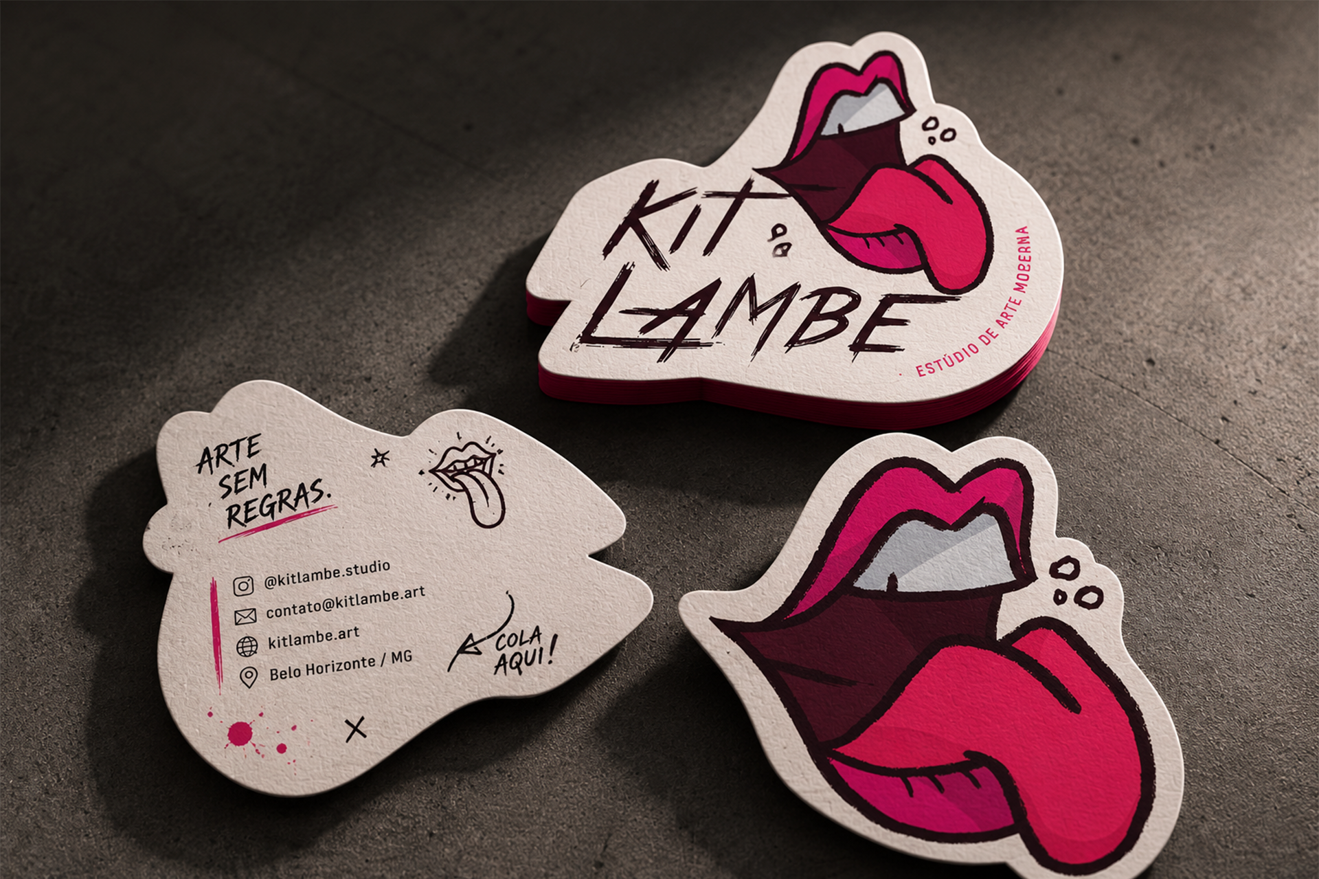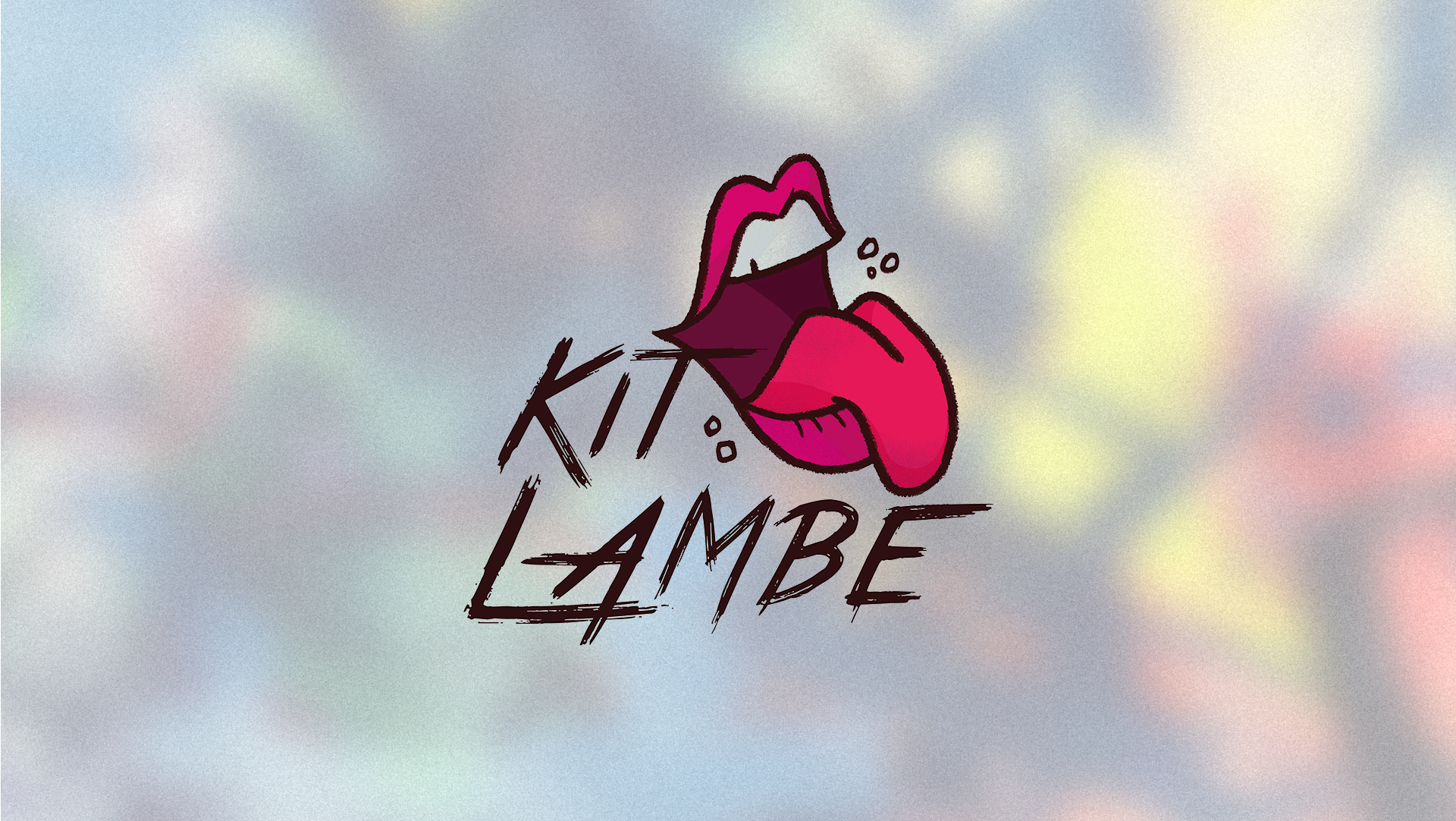
Kit Lambe’s visual identity is born from the essence of urban art: spontaneous, imperfect, and completely free from rules. Inspired by the energy of street posters, graffiti, and interventions that transform the city into an open-air gallery, the brand breaks away from traditional standards to convey authenticity and personality. Every element was created by hand, without the use of pre-made fonts or rigid geometric shapes, allowing imperfection itself to become part of the identity and reflect the creative process of making art without limits.
The color palette combines intense shades of pink and burgundy, representing boldness, expression, and irreverence, contrasted with dark, organic strokes that reinforce the handcrafted aesthetic. The typography was entirely hand-drawn, with expressive brush-like marks and an intentionally irregular rhythm, while the mouth illustration, also created manually, symbolizes the voice of creativity, freedom of expression, and artistic provocation. The result is a vibrant, experimental, and living brand that embodies the philosophy of Kit Lambe: a space where art exists without formulas, without standards, and above all, without fear of experimentation.