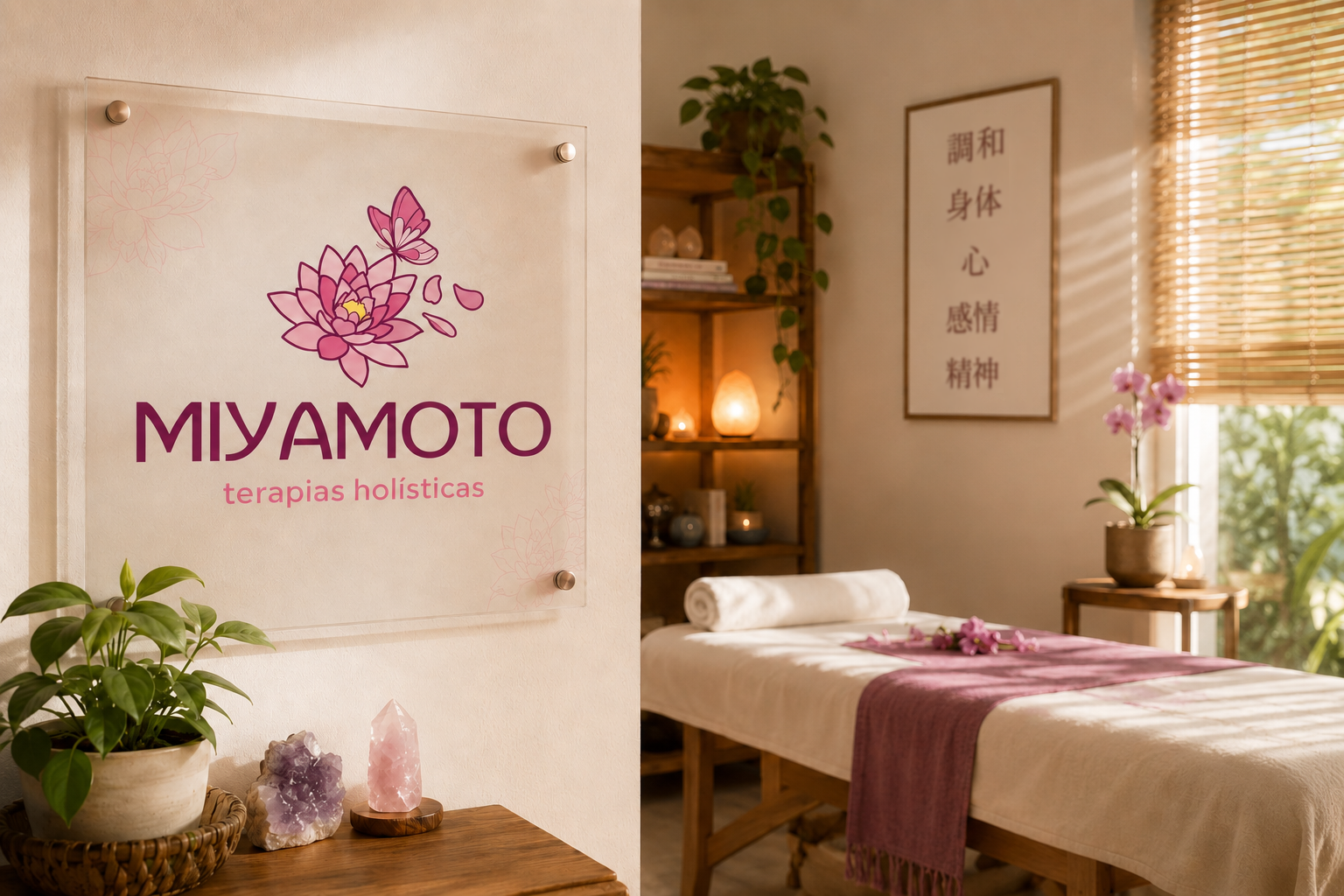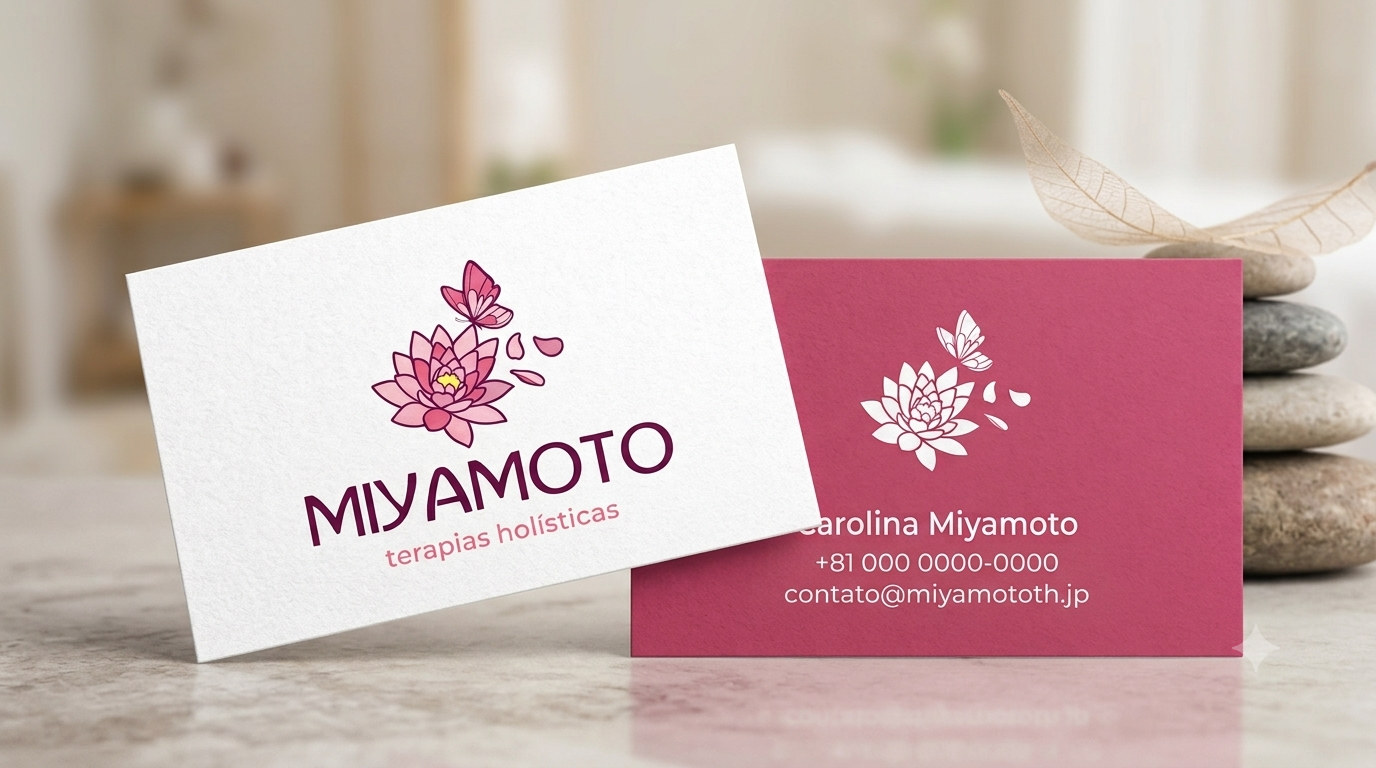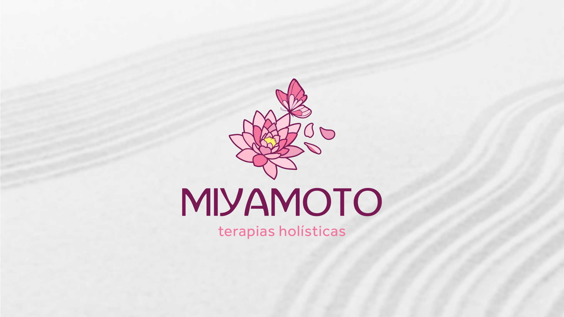
The visual identity of Miyamoto Holistic Therapies was designed to convey warmth, balance, and renewal, reflecting the essence of the treatments offered and the compassionate approach to serving the Brazilian community living in Japan. The logo combines a lotus flower—widely recognized as a symbol of spiritual awakening, healing, and personal growth—with a butterfly, representing transformation, freedom, and new beginnings. The scattered petals reinforce the idea of lightness and continuous evolution, illustrating the personal journey each client experiences throughout the therapeutic process. Together, these elements create a delicate yet memorable identity that communicates serenity, trust, and emotional well-being from the very first impression.
The color palette is composed of harmonious shades of pink and magenta, chosen to evoke affection, empathy, care, and emotional balance, while the yellow detail at the center of the lotus symbolizes energy, vitality, and hope. The primary typography features a clean, geometric sans-serif typeface that balances modernity with elegance, conveying professionalism without sacrificing warmth. The secondary typeface, presented in lowercase with soft, rounded forms, enhances the feeling of accessibility and human connection. The result is a refined and harmonious visual identity that reflects both the calming nature of holistic therapies and the cultural context of Japan, creating a brand that inspires confidence while making Brazilian clients feel welcomed, understood, and connected to their roots.