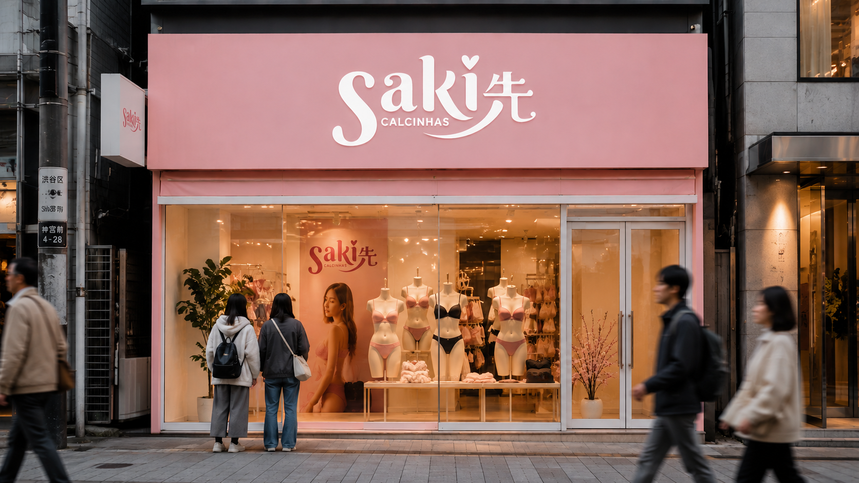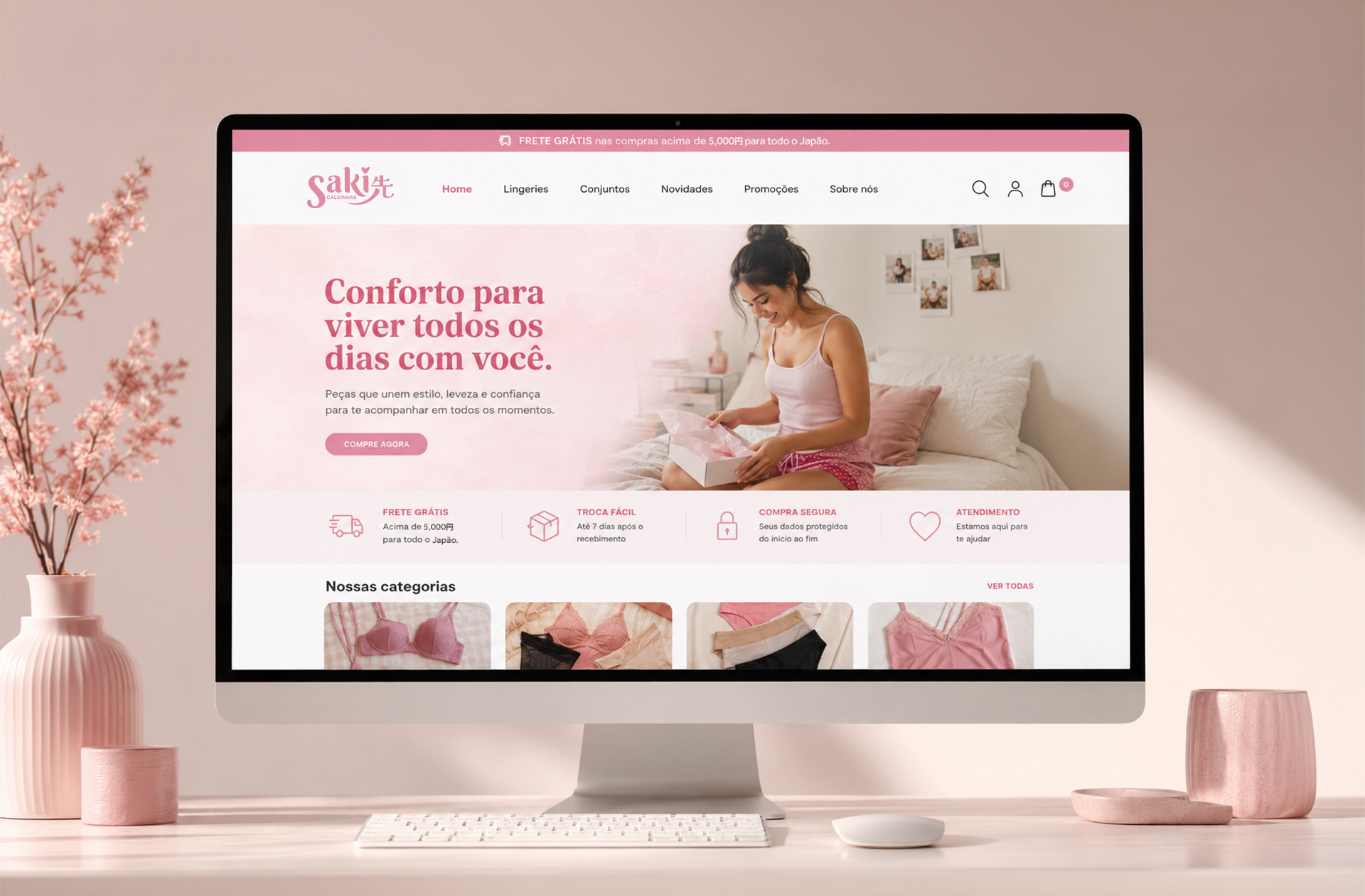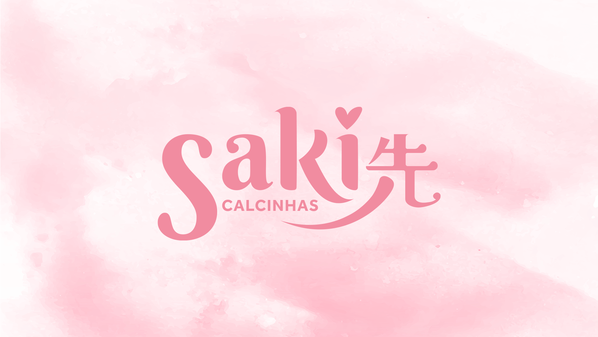
Saki Calcinhas was created by Brazilian entrepreneurs living in Japan, bringing the comfort, fit, and femininity of Brazilian lingerie to the Japanese market. The brand identity was developed in partnership with the Japanese graphic production company Nekyas, reflecting the harmony between Brazilian warmth and Japanese elegance through a clean, modern, and memorable visual language.
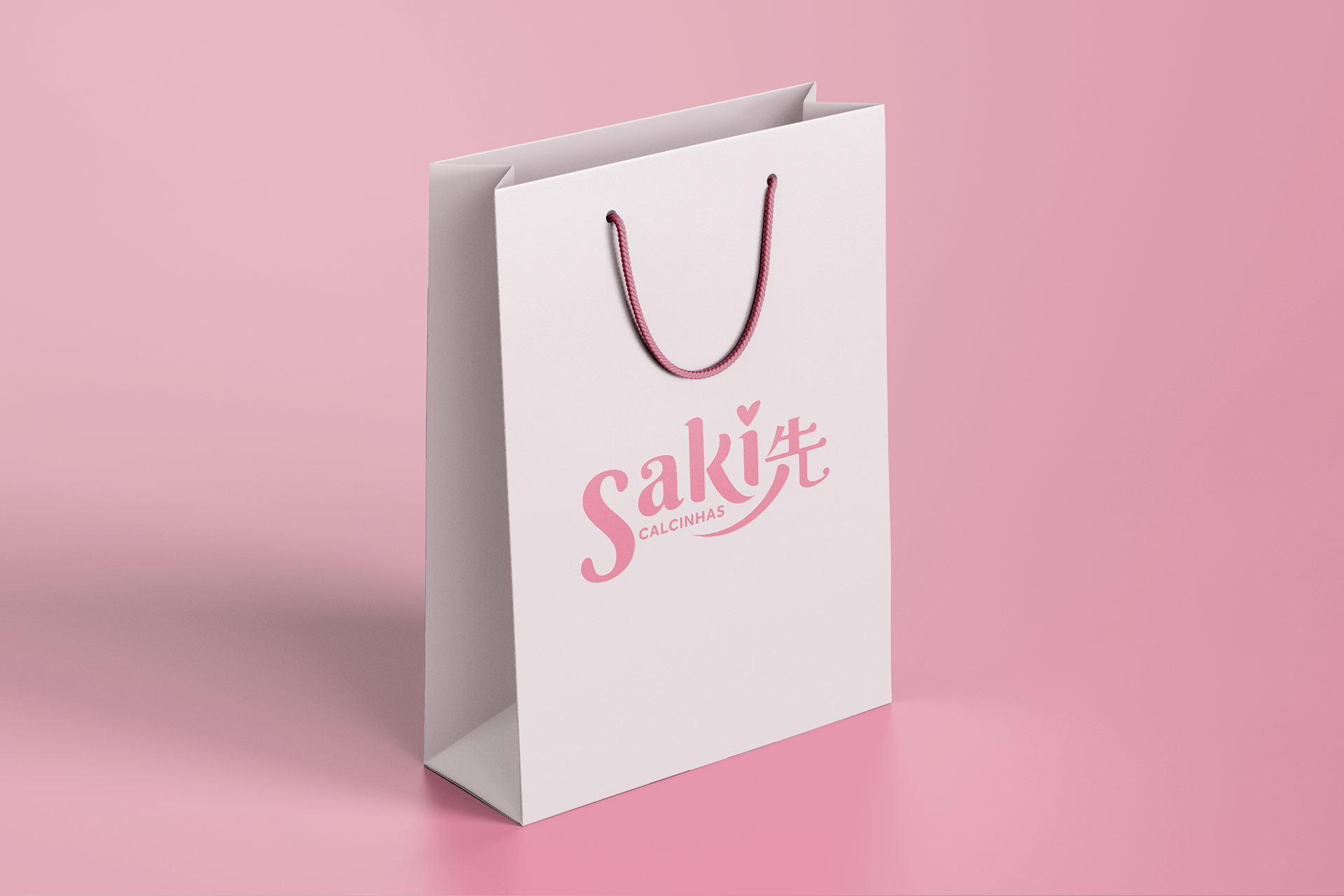
The logo's defining feature is the seamless integration of the kanji 先 (Saki) into the typography, transforming it into a unique brand symbol. Its flowing lower stroke is inspired by the softness of a satin ribbon, adding movement while subtly referencing the world of lingerie.
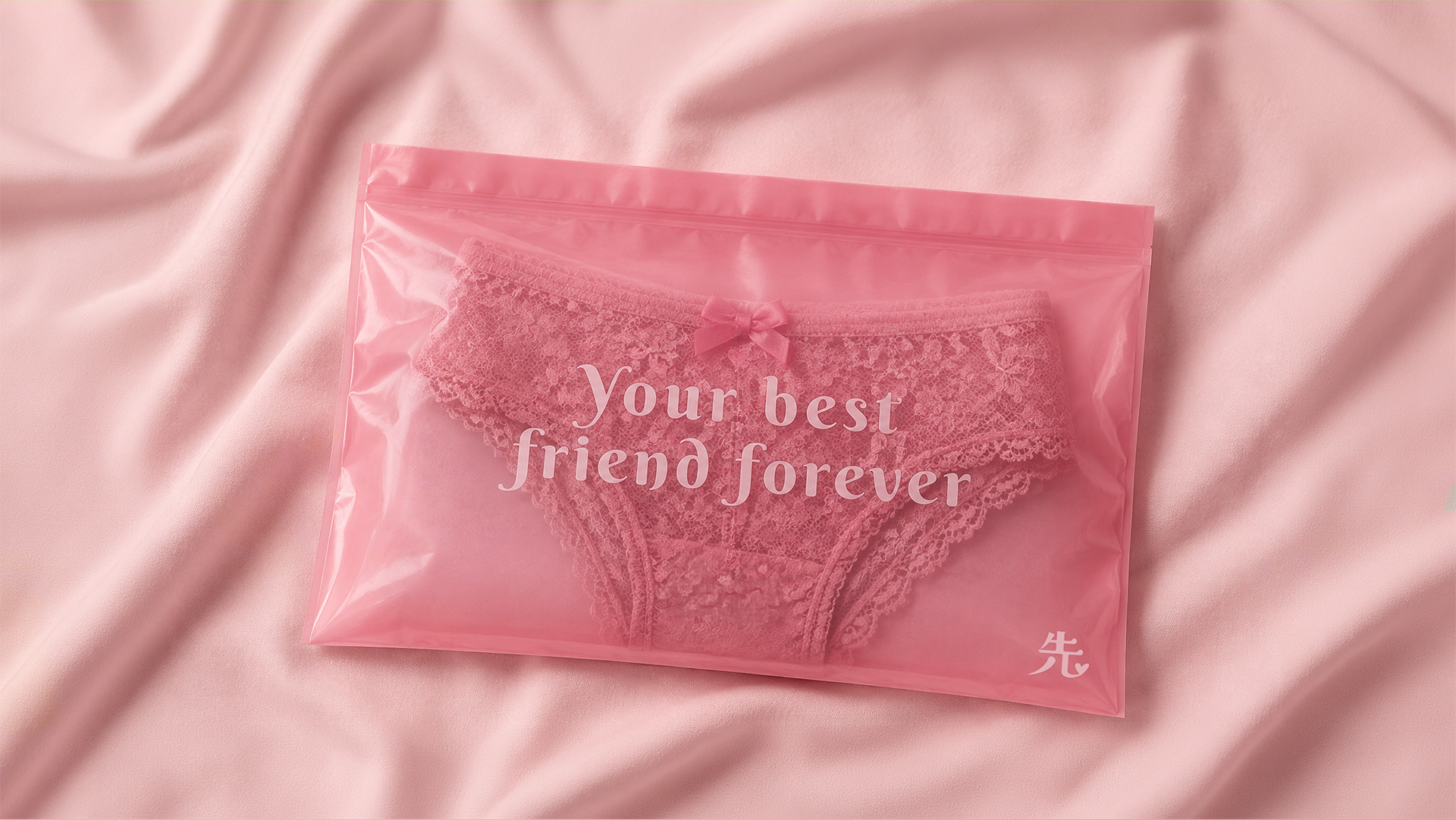
Soft curves, refined typography, and a delicate pink palette reinforce the brand's values of comfort, confidence, and femininity. More than a logo, the identity represents the meeting of two cultures, creating a distinctive brand that feels both familiar and authentic to the Japanese audience.