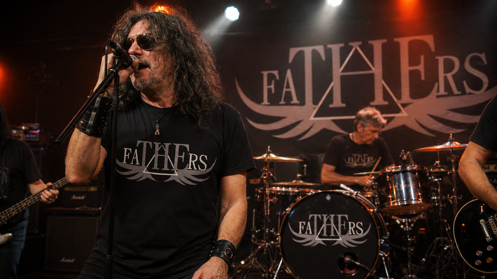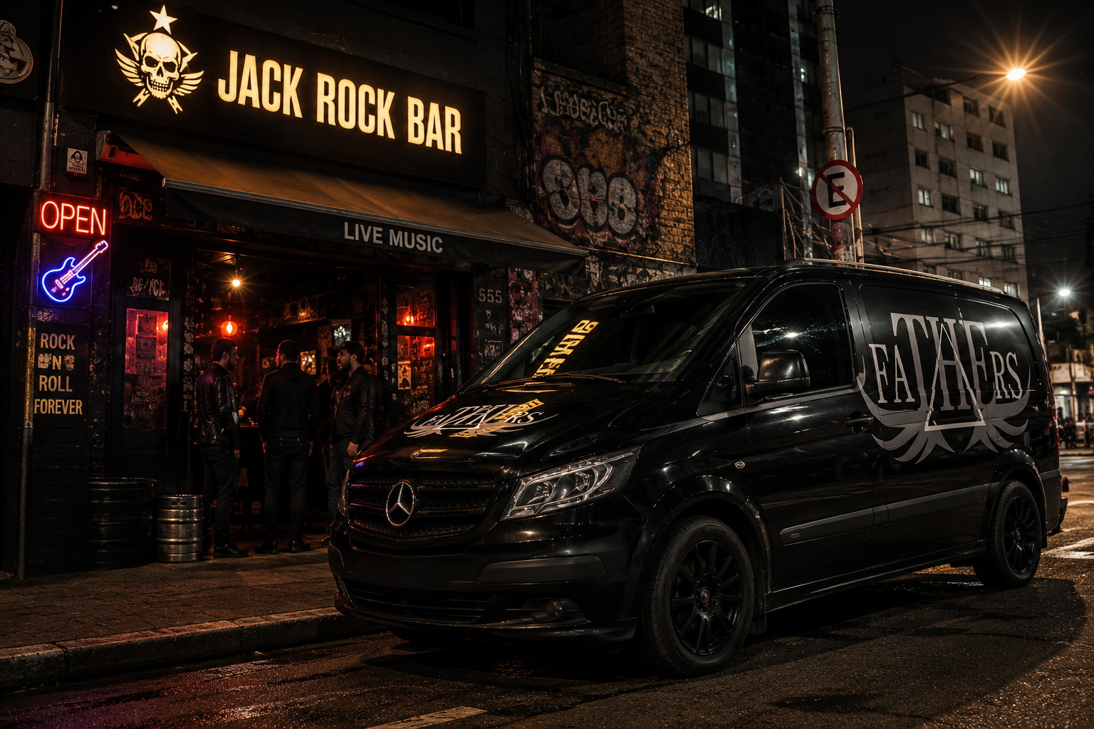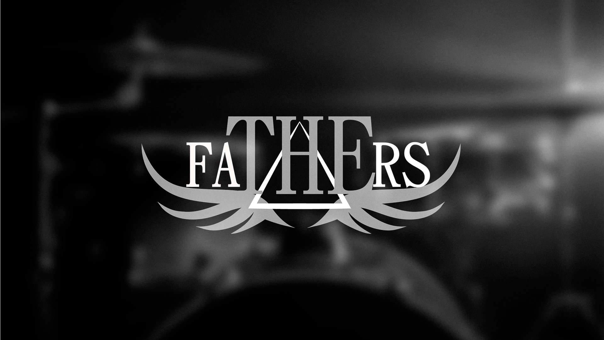
Created for The Fathers, a Brazilian rock band made up entirely of fathers, this visual identity was designed to reflect the band's maturity, authenticity, and powerful stage presence. The concept combines classic rock influences with a refined, timeless aesthetic, resulting in a logo that feels both bold and sophisticated. The typography features high-contrast serif typefaces that convey strength and elegance, while the central triangle serves as a visual anchor, symbolizing unity among the band members. The stylized wings add a sense of freedom, movement, and energy, reinforcing the spirit of live rock performances.
The black, white, and gray color palette was chosen for its versatility and its strong connection to the rock music scene, ensuring outstanding legibility across both light and dark backgrounds. The logo was designed to perform seamlessly on a wide range of applications, including stage backdrops, drum kits, band merchandise, instrument cases, tour vans, apparel, and promotional materials. Developed specifically for a contest to select the band's official visual identity, this design earned a place among the three finalists, highlighting its strong visual impact, technical quality, and ability to capture the essence of The Fathers as they perform in bars, music venues, and intimate live events across Brazil.